
CATEGORY:
Digital Product, UX/UI, Branding
SECTOR:
B2B Web Application | GovTech | Sustainability
ROLE:
UX/UI Designer & Team Lead

Circularity Tool Add-on for eLCA | B2B
Simplifying complex, multi-step expert workflows reducing task time by 38%
About.
TL;DR
Context & Problem
Circularity Tool is an add‑on to eLCA — Germany’s official platform for life‑cycle assessment. It calculates a building’s Circularity Score.
eLCA experts and novices alike struggled to navigate a complicated workflow that required manual pollutant selection and made it unclear how to calculate the Circularity Score.
My role
As the UX/UI designer and team lead, I set the end‑to‑end design vision, personally interviewed five architects and sustainability professionals, synthesised their pain points and led a cross‑functional team. I translated research into a four‑step guided flow and an AI‑powered Pollutants Match module, steering iterative prototyping and testing.
Solution
The redesigned flow clarifies where to create and manage projects, automates pollutant selection and embeds contextual explanations. A progress bar and clear dashboard guide users through the Circularity Score calculation, while the AI module suggests compatible pollutants with a match percentage.
Impact
The redesigned flow enabled users to complete core task 38% faster, interpret 80–90% of indicators correctly and report a 1.4× increase in confidence (post-flow self-assessment). By cutting manual work and clarifying the process, the solution saves experts hours and reduces cognitive load. For instance, if each assessment used to take about two hours, a 38 % reduction means roughly 45 minutes saved per task. Across multiple assessments, this frees up hours of expert capacity each week.
The approach was recognized by BBSR as a significant advancement for the Circularity Tool.
Timeline & Constraints
I delivered the final prototype in a 6‑week sprint and had access to the live tool only in the final week. The Circularity Tool is a closed system, so testing sessions were also limited.
Collaboration
The project was developed in collaboration with N3XTCODER (Berlin) and leading governmental research institutes in Germany (BBSR) and Austria (IBO).
Research & insights.
To understand usability barriers and mental models within the Circularity Tool, I conducted exploratory user research focused on how professionals with different levels of expertise navigate complex sustainability data.
01 | Research approach
To understand how users work with the Circularity Tool, I:
collected exploratory survey responses from architects and LCA professionals
conducted five in-depth interviews with sustainability professionals and architects to understand goals, terminology, and decision logic when assessing circularity
held continuous feedback sessions with an architect in our team, who reviewed iterations, validated assumptions, and provided domain-specific critique throughout the design process
This combination of methods uncovered the main logic and pain points in the process of the Circularity Score calculation.
Research constraints
Because Circularity Tool is a closed domain, access to active end users was limited. We compensated by triangulating survey data, expert interviews and SME feedback to identify recurring patterns, rather than relying on single opinions.
Key findings
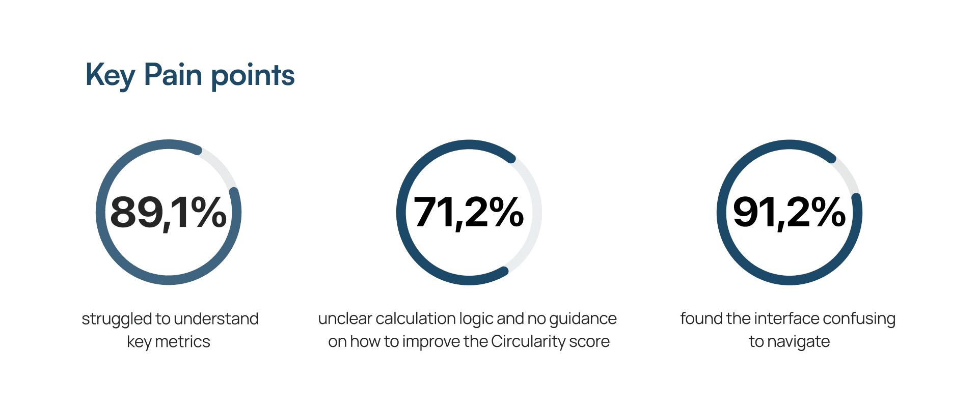
Lack of clarity: 89% of respondents struggled to interpret key indicators and clarify how they affect the final Circularity Score
Opaque logic: 71% couldn’t explain how the score is calculated and 91% found navigation confusing
Lack of onboarding: users felt abandoned on first launch and lacked contextual guidance within the process of calculation
Interface overload: the existing UI combined data, controls and indicators in one dense screen, which overwhelmed both experts and novices
These insights led me to design a structured four-step UX Corridor with clear progress indicators and AI‑assisted Pollutants Match.
02 | UX Strategy & Design Hypotheses
Building on the key findings, I focused on five pillars:
Clarifying the eLCA → Circularity Tool connection, helping users understand where new projects are created and how data flows between the tools
Adding step-by-step guidance for each phase of the Circularity Score calculation process
Embedding contextual explanations and indicator definitions directly into the interface
Adapting the UI for experts and novices through clearer hierarchy and reduced complexity
Making sure users see a clear link between what they enter, how it’s evaluated and the final score
These principles informed all design decisions, including the ‘Create new project’ pattern, contextual labels, the four‑step UX Corridor and the AI‑assisted Pollutants Match.
How the refined flow addresses key pain points
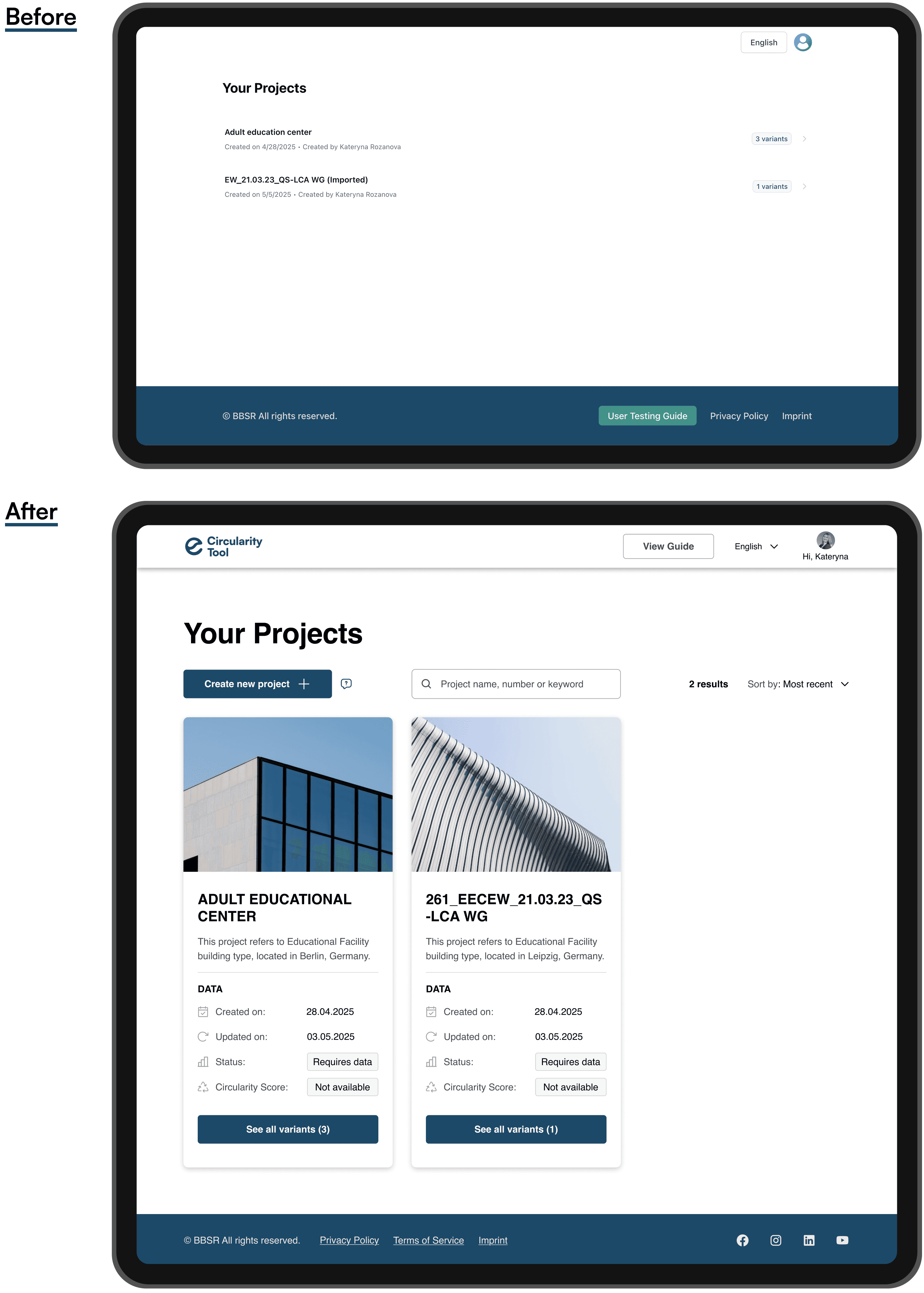
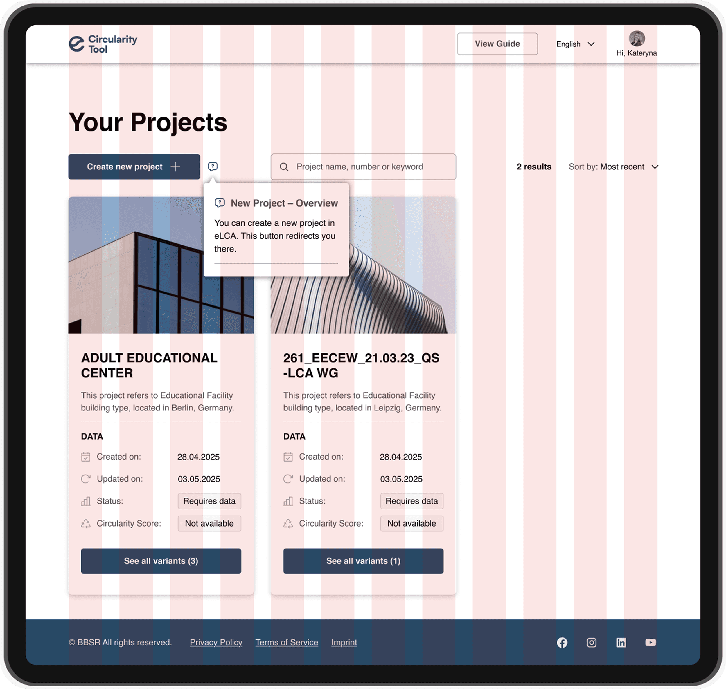
Unclear entry point → “Create new project” pattern and tooltip explaining where project setup happens
Project Dashboard (Before / After)
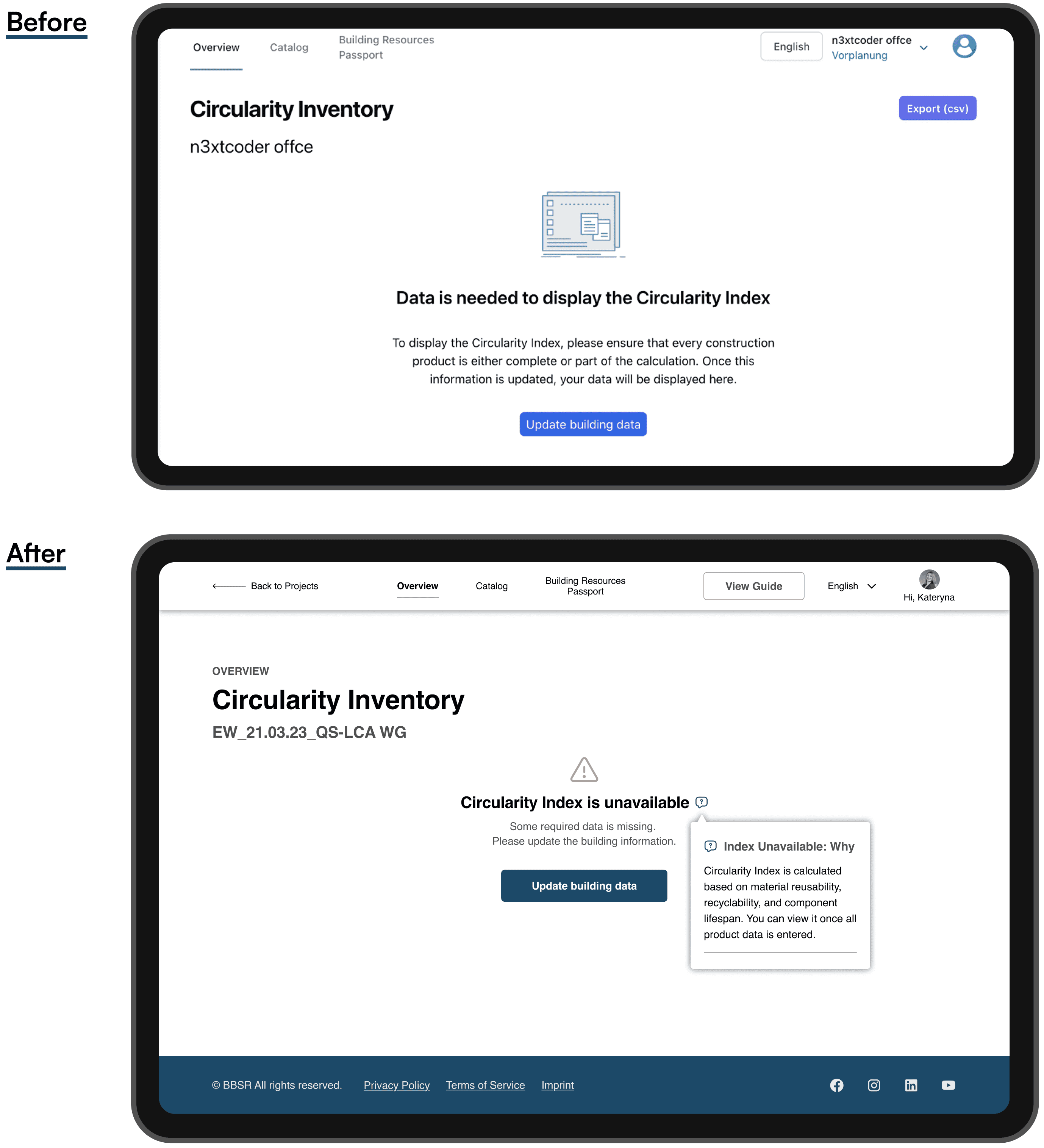
Confusing indicators → added contextual labels and explanations near key metrics to make interpretation easier for both experts and non-experts
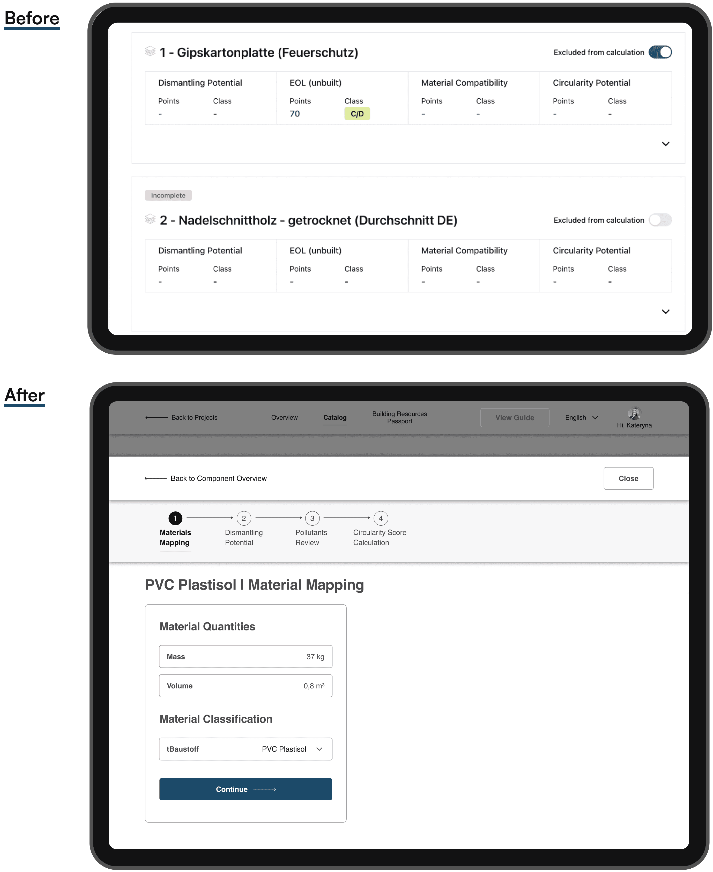
Circularity Inventory Overview (Before / After)
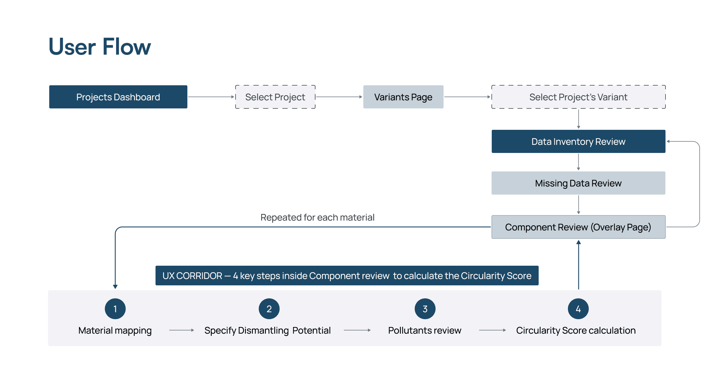
Low transparency of the calculation process → structured the core actions into a 4-step “UX Corridor” (material mapping, dismantling potential, pollutants review, Circularity Score calculation). During the pollutants review step, users can either select pollutants manually or rely on an AI-assisted Pollutants Match, which suggests compatible options with a match percentage, helping users make an informed choice.
Circularity Score Calculation Overview (Before / After)
By improving structure and logic, I reduced cognitive load and also made circularity assessment more approachable for a broader range of professionals.
Results.
01 | Contextual Support & Simplified UI
A | Projects Dashboard (Entry Point)
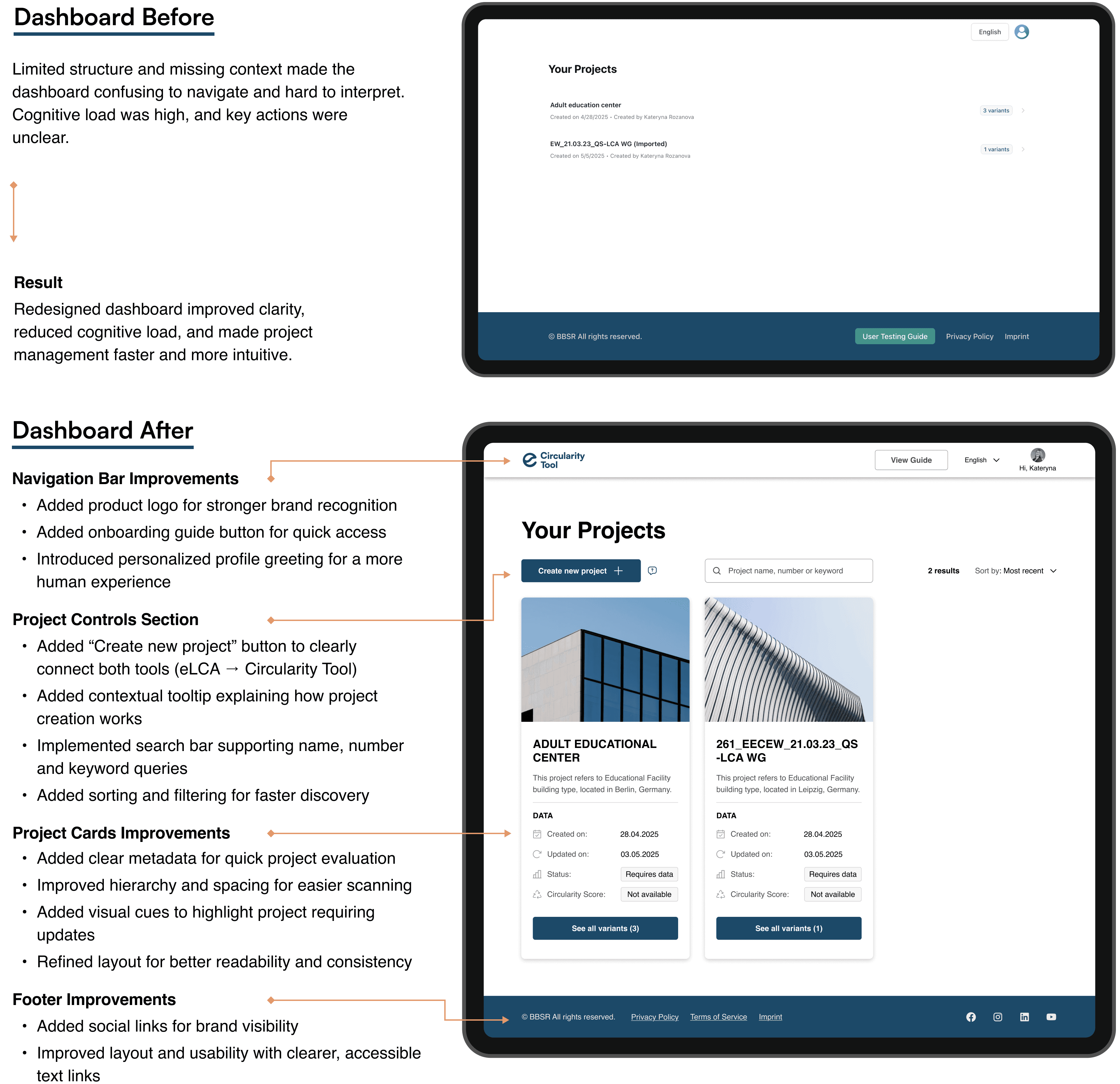
What was done
The following interface refinements made the system more structured, guided, and visually consistent, reducing cognitive load and improving overall usability.
Established a clear connection between eLCA and the Circularity Tool by introducing the new “Create new project” button, a key bridge that directs users to initiate projects in eLCA, while all Circularity Score calculations are handled within the Circularity Tool
Added a project search bar with filters, allowing users to quickly find and manage existing projects
Improved navigation hierarchy by restructuring the dashboard layout and emphasizing primary user actions
Redesigned project cards with metadata and image previews, improving recognizability and comparison across projects
Enhanced the navigation bar and the footer to strengthen visual balance and accessibility, aligning the overall UI with the updated design language
Grid
I introduced a 12-column modular grid (32 px gutters, 80 px margins) for structural clarity and spatial balance.
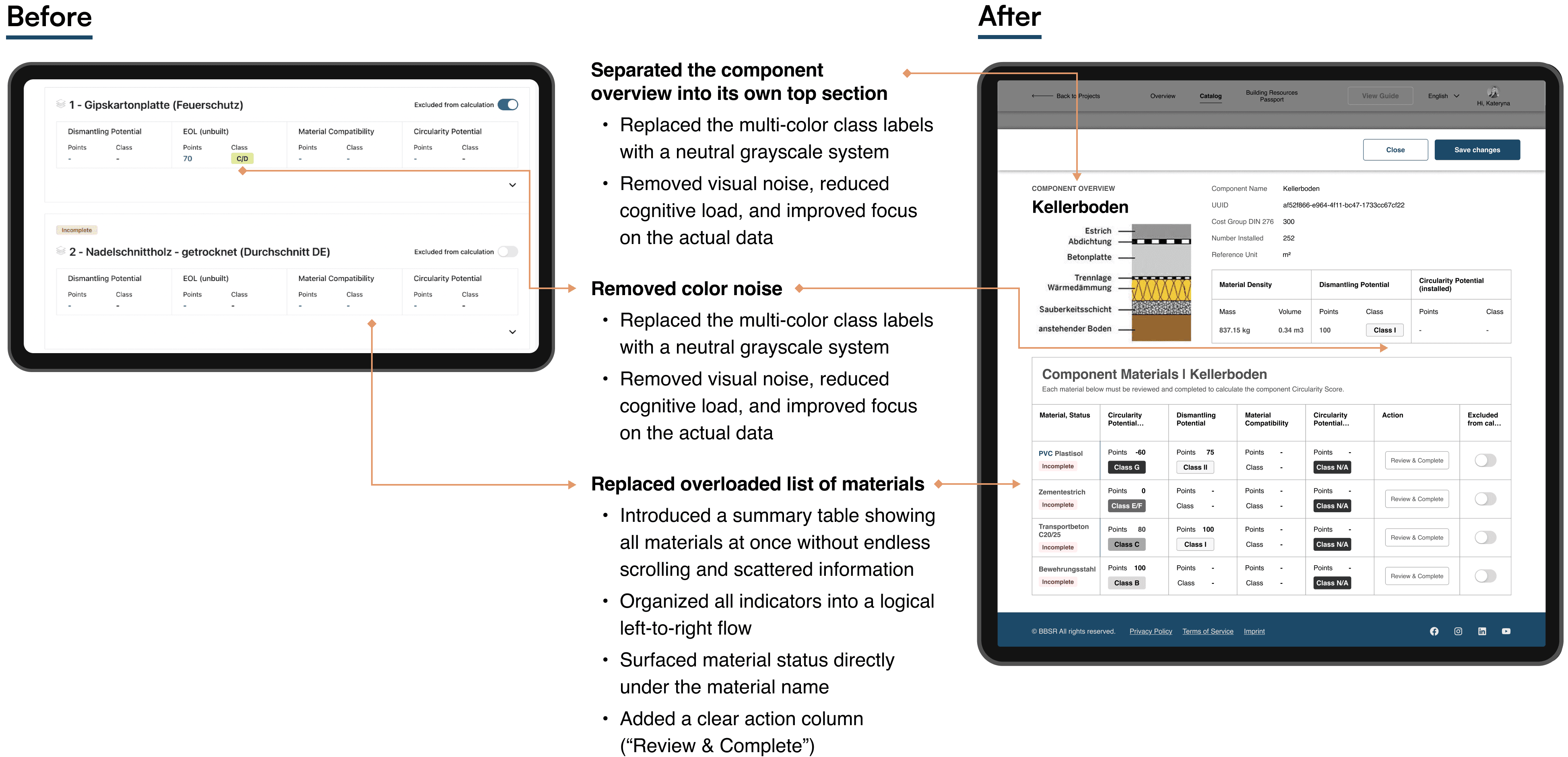
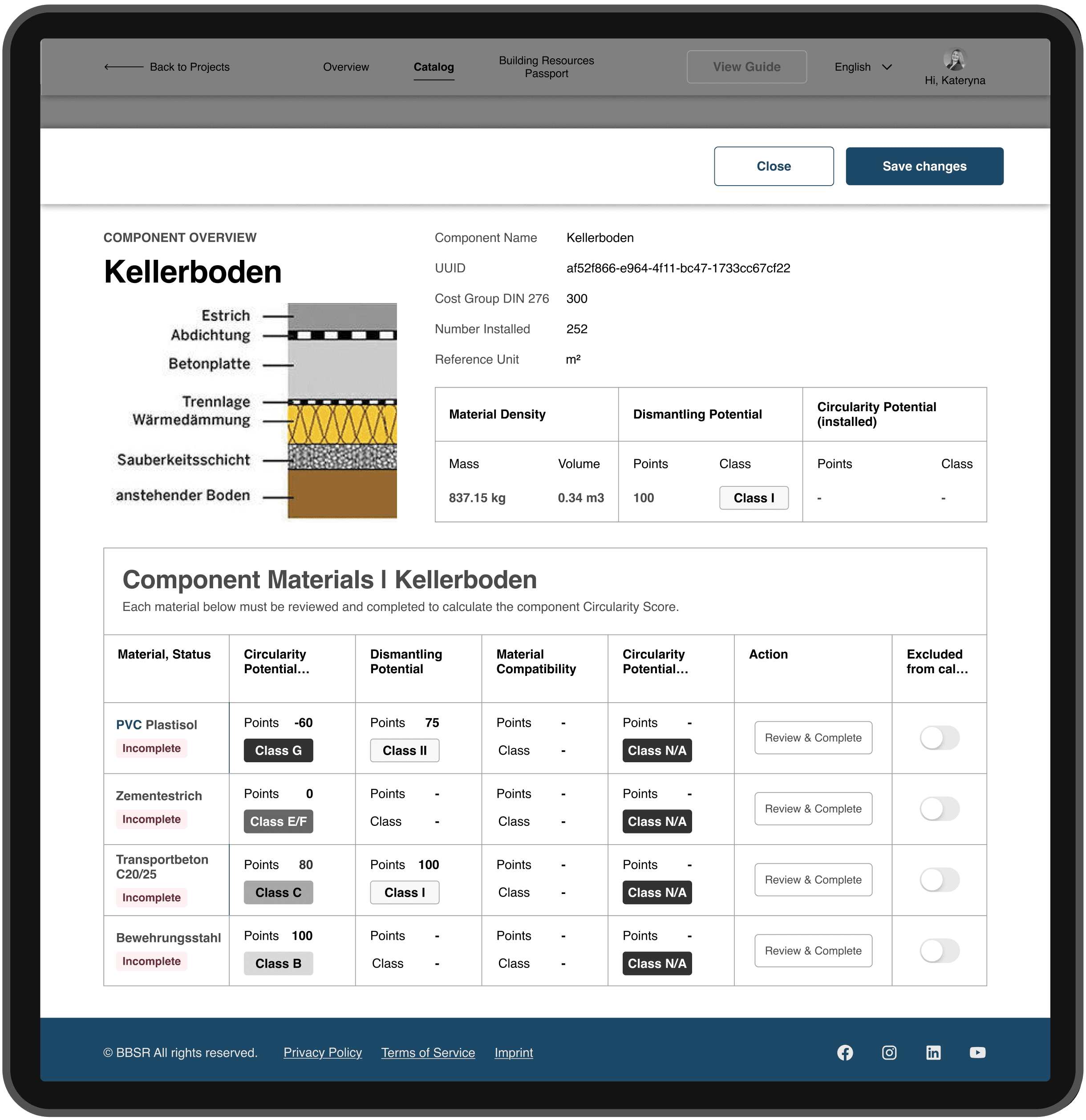
B | Component Review (Overlay Page)
The Component Review and the Circularity Score calculation for each material are designed as an overlay page. This keeps the user anchored in the Missing Data workflow while providing a dedicated, focused workspace for completing material-specific inputs.
Using an overlay instead of a separate page or modal preserves context, avoids navigation loss, and provides enough space for complex data review. This approach makes the process faster, clearer, and more predictable, especially when repeated for multiple materials.
Key Improvements (What I Did & Why)
Separated the component overview into its own top section
→ Clarifies context and helps users understand what they’re editing before diving into details.
Consolidated all component materials into one structured table
→ gives users a complete overview without endless scrolling and scattered information.Replaced the multi-color class labels with a neutral grayscale system
→ removes visual noise, reduces cognitive load, and improves focus on the actual data.Surfaced material status directly under the material name
→ makes “Incomplete”/“Complete” instantly visible and easier to prioritize.Added a clear action column (“Review & Complete”)
→ places the primary CTA exactly where users expect it, cutting unnecessary steps.Organized all key indicators of each material into a logical left-to-right flow
→ improves scannability and understanding of each material’s stateReduced layout density and aligned spacing for consistency
→ creates a cleaner, calmer interface that’s easier to read and navigate.Component Overview (Before / After)
C | Step-by-Step UX Flow
To reduce cognitive load and bring clarity to a previously fragmented process, I introduced a four-step “UX Corridor”, a structured flow that guides users through data input, validation, and score calculation.
Circularity Score Calculation Overview
— Four-step UX Corridor
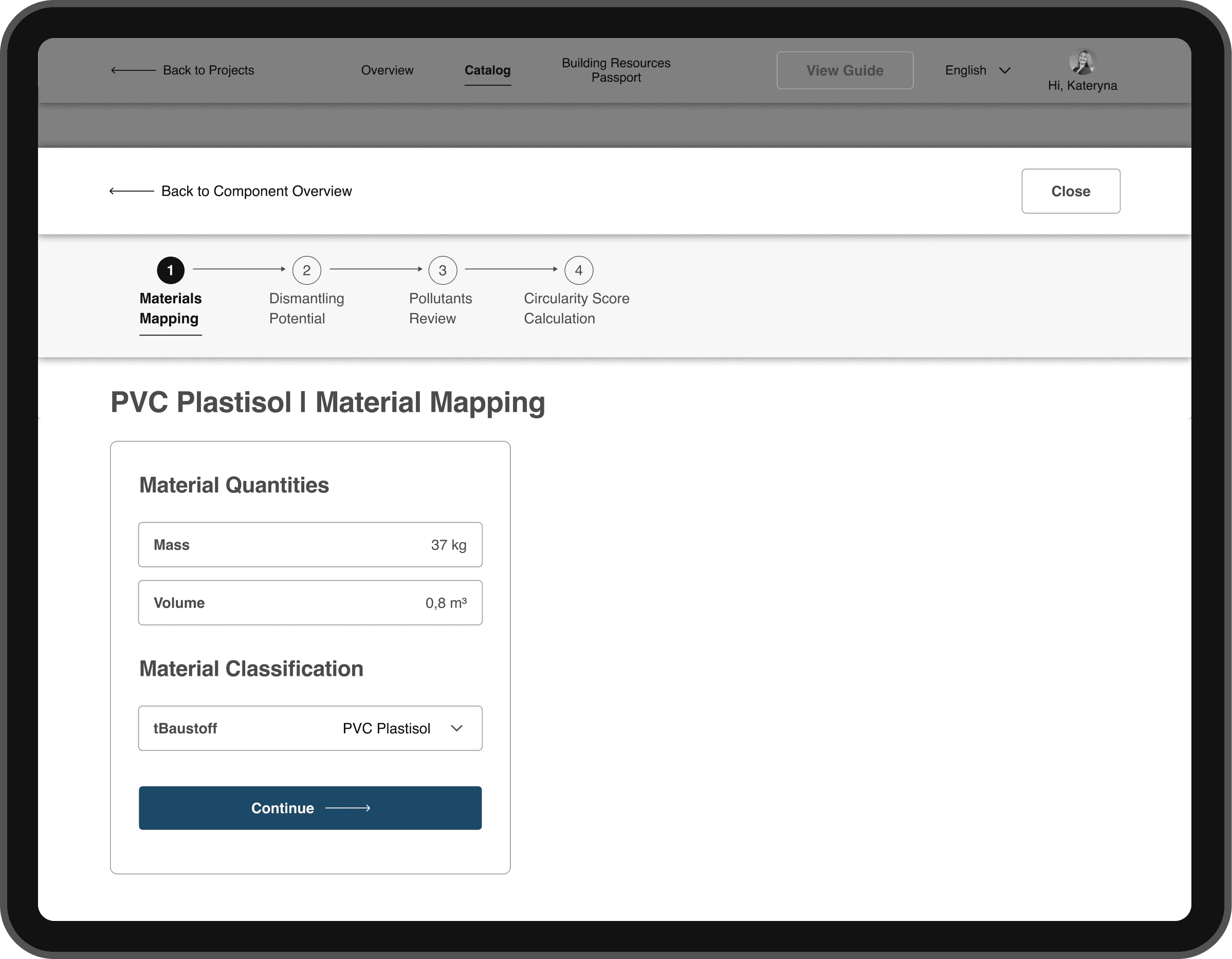
In the previous version, all material data was displayed in long, continuous layouts, making it difficult to track progress or understand where users were in the process.
The redesigned structure replaces those endless screens with a modular, step-by-step flow and a summary table of all materials, allowing users to control progress, stay oriented, and complete assessments with confidence.
The four key stages
Material Mapping: connect components with their corresponding material data
Dismantling Potential: define how each component can be separated and reused
Pollutants Review (AI-assisted and manual): identify and validate potential contaminants
Score Calculation: generate and verify the Circularity Score of the component
Step 2 — Dismantling Potential
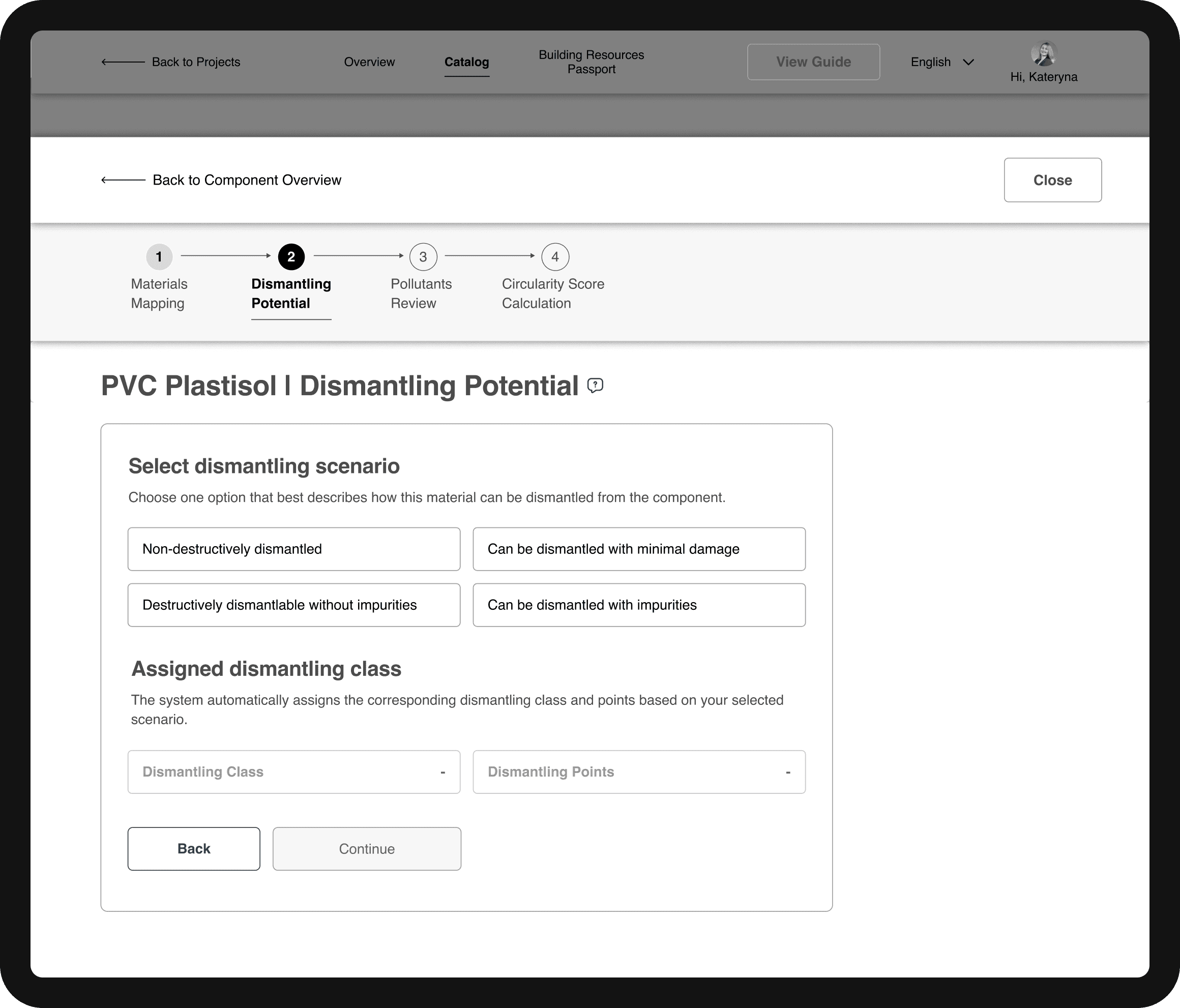
The visual progress bar reinforces this structure, helping users instantly see their position and understand what’s required at each step, turning a complex technical workflow into a clear, guided process.
02 | UX Corridor and Pollutants selection
To simplify one of the most complex stages, pollutant assignment, we introduced AI-powered suggestions that predict pollutant values and recommend optimal matches based on compatibility scoring.
Step 3 — Pollutants Review (AI Match)
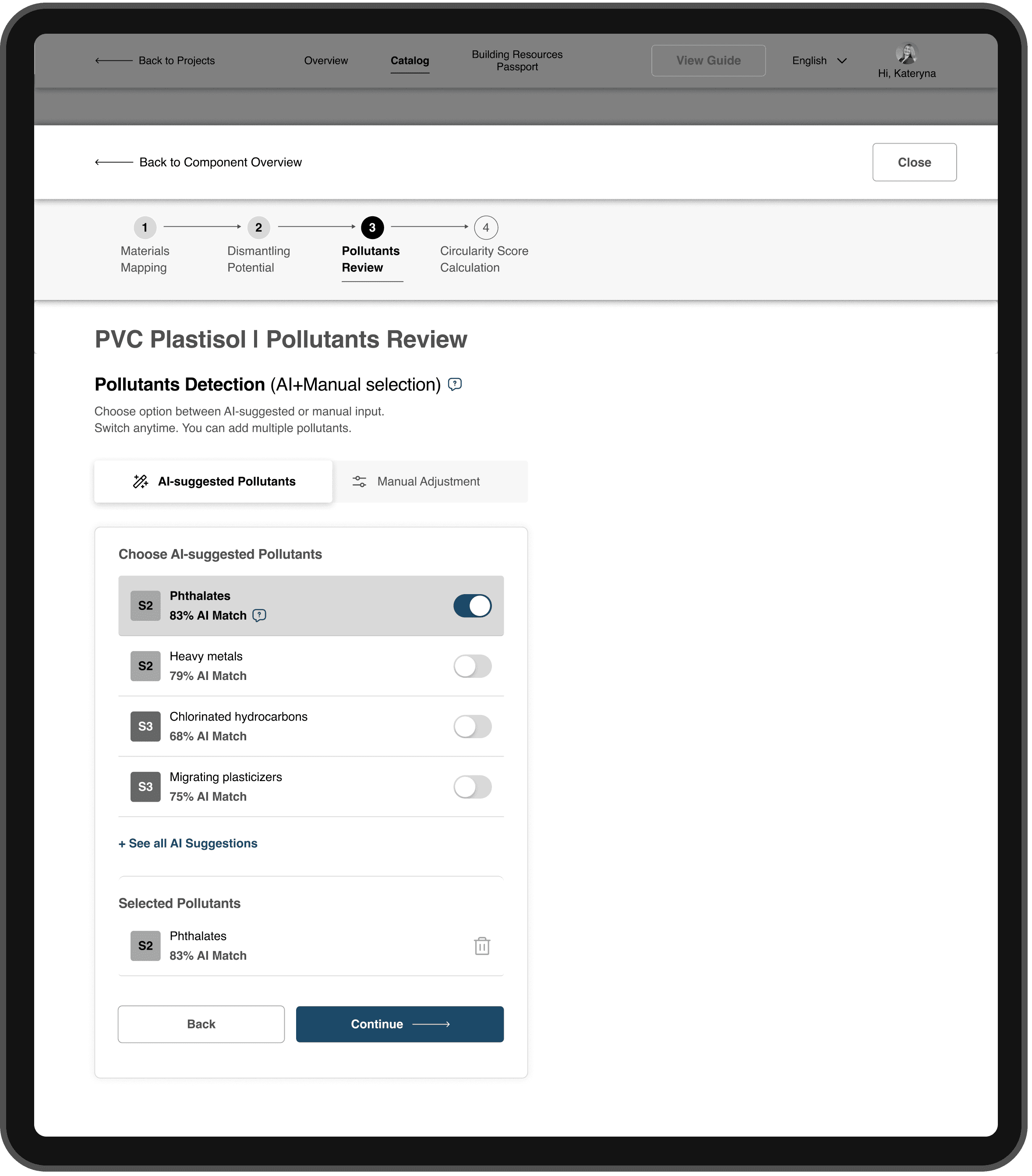
Each AI suggestion includes a compatibility percentage, showing how well a pollutant aligns with the selected material.
<60% — Weak match: weak alignment, requires manual review
60–79% — Moderate match: moderate fit, should be validated by user
80–100% — Strong match: strong fit, suitable in most cases
This structure allows users to make confident decisions without deep technical knowledge, while keeping the process transparent and verifiable.
UX Corridor Enhancements
The UX Corridor menu is fixed at the top of the interface and updates dynamically as users fill in data.
It clearly shows progress through all four stages: from Material Mapping to Circularity Score Calculation
This persistent navigation helps users stay oriented, track progress, and instantly see which steps are completed or pending
Step 3 — Pollutants Review (Manual Adjustment)
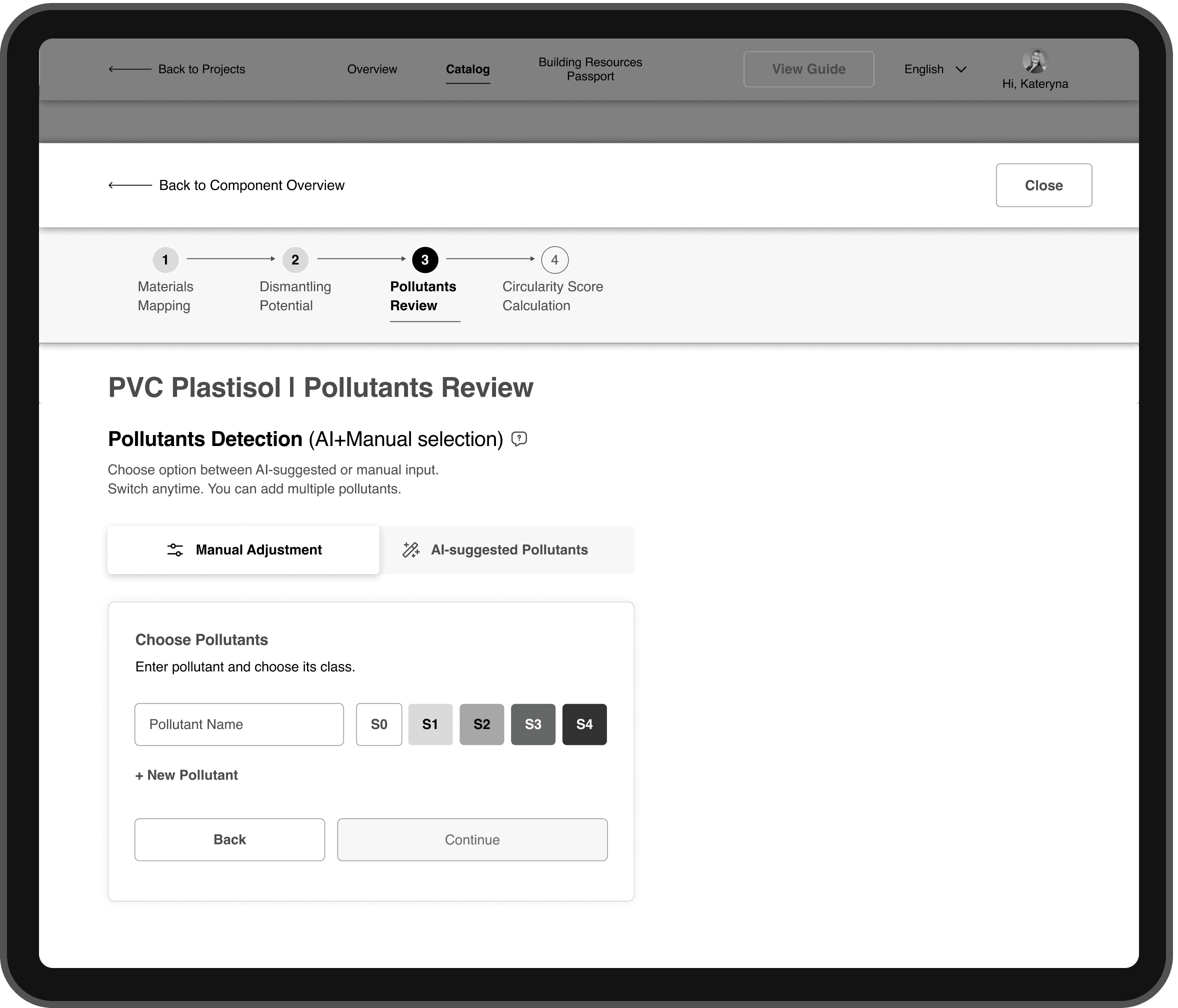
Pollutant Stage Improvements
1) Introduced greyscale-coded pollutant classes (S0–S4) for quick visual distinction
2) Added dual input modes
AI-suggested pollutants for quick automated selection
Manual adjustment for experts who prefer full control
3) Both modes coexist within the same unified workflow, maintaining autonomy and consistency.
Outcome
The dual-mode interaction model reduces cognitive load
Balances automation with expert control,
Ensures transparency across different user types
03 | Measurable Outcomes
To validate the redesign, I conducted moderated remote usability tests with architects who regularly work with LCA-related tools.
Each session was conducted online with screen sharing. Participants were asked to complete realistic assessment tasks based on the Circularity Tool workflow, while verbalizing their thoughts and decision-making process.
Tasks
Participants were asked to:
Navigate the updated project dashboard
Identify missing data and required inputs
Complete a Circularity Score calculation
Interpret indicators and system feedback
These tasks reflected real-world decision-making scenarios, rather than isolated UI interactions.
Metrics & Measurement
1) Task completion time
Recorded per task and compared qualitatively to baseline observations from the previous version of the tool.
2) Indicator comprehension
Measured through follow-up questions after task completion, focusing on whether users could correctly explain:
what the indicator represents
how it impacts the final Circularity Score
3) User confidence
Measured via a short self-assessment questionnaire using a 1–5 Likert scale, where participants rated how confident they felt interpreting results and making decisions based on the system feedback.
Results at a Glance
38% faster task completion
80–90% correct comprehension of indicators
1.4× increase in user confidence
These results confirmed that the redesigned Circularity Tool significantly improved clarity, speed, and user trust, especially for users with limited LCA experience.
04 | Next Steps & Takeaways
Next steps & recommended improvements
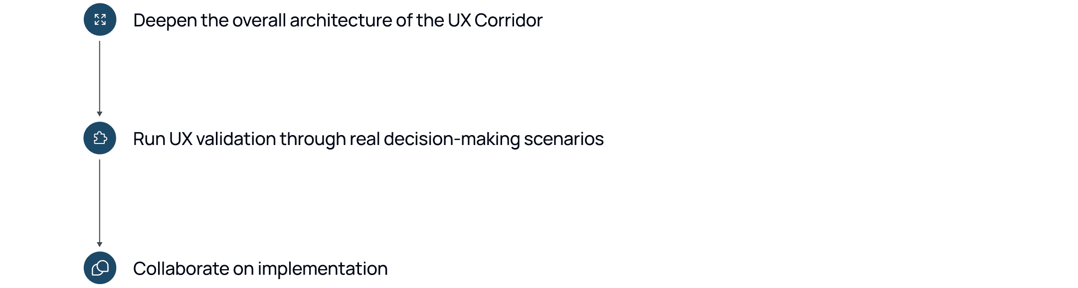
1) Strengthen the overall UX architecture and clarify system logic
Clarify and streamline the core logic behind the redesigned system
Ensure clear logic and smooth transitions between the UX Corridor, component overview, AI recommendations, and manual controls
Define detailed interaction flows, microstates, and module-level dependencies
2) Validate the UX using realistic decision-making scenarios
Create realistic case simulations involving both experts and non-experts (Focus tests on key actions: resolving missing data, editing materials, improving the calculated Circularity Score)
Observe how users interpret system feedback and confidence levels, and identify friction points between AI-assisted and manual workflows
Continue both moderated and unmoderated testing to measure comprehension and confidence improvements across different user types
3) Collaborate on implementation
Work with developers to align component behavior and data logic with the designed UX structure
Support implementation by reviewing build prototypes and validating consistency in staging environments.
Together, these steps form a roadmap for evolving the Circularity Tool into a coherent, scalable, intelligent UX ecosystem, where data, logic, and design work seamlessly together.
Takeaways
1. Structure drives clarity
The four-step UX Corridor and material overview table transformed complexity into control: users always know where they are and what’s next.
2. Transparency builds trust
Balancing AI suggestions with manual control increased user confidence and made decision-making feel explainable, not automated
3. Critical thinking never stops
Continuous validation with both experts and newcomers proved essential for refining logic, indicators, and overall comprehension.
05 | Circularity Tool Add-on in Action
This short demo shows the end-to-end user flow form viewing project data to completing all steps required to calculate the Circularity Score.
Steps shown in the video:
Landing on the updated project dashboard and reviewing its capabilities
Selecting a project to calculate the Circularity Score
Viewing detailed project data and available design variants
Entering the Circularity Inventory and being prompted to add missing building data
Navigating to the Catalog to view missing inputs
Drilled down to the component level to input data step-by-step(UX Corridor):
Editing the materials
Determine Dismantling Potential
Choosing pollutants
Calculating the Circularity Score
Returning to the Circularity Inventory to view the total Circularity Score
Watch the user flow with the above-mentioned steps:
Testimonial.
I consider the Pollutants Match approach to be the most impactful UX improvement

Isabel Dietsch
Project Manager at BBSR

