
CATEGORY:
UX/UI | Product Thinking | Branding
SECTOR:
Health Tech | B2C | SaaS | AI - assisted personalization
ROLE:
UX/UI Designer, (end-to-end, solo)

AI-powered Personalized Eye Care App | B2C
Designing a trust-first experience for sustainable eye care habits
About.
TL;DR
Context & Problem
SeeBetter is a personalized AI‑powered eye wellness app.
Research showed that 46.7 % of people spend over 8 hours a day on screens and 86.7 % feel constant eye strain, yet most eye‑care apps undermine trust early by offering generic exercises and introducing hidden paywalls before users experience real value.
The core goal of this project wasn’t creating eye exercises — it was designing an experience where users feel safe, confident, and motivated to engage with from the very first interaction.
My role
As an end‑to‑end product designer, I led the research (27 survey responses, 4 in‑depth interviews, competitive analysis), mapped the user journey and defined three core principles: clarity, transparency and emotional ease.
Solution
I designed a calm, step‑by‑step onboarding with a lightweight vision check, AI‑powered personalized plans, progress tracking and transparent pricing. The app uses a soothing blue palette to reduce visual fatigue and aligns with WCAG accessibility standards.
Impact
In prototype testing, users described the experience as transparent and calming, rated their confidence at 4.4/5 and appreciated the absence of early paywalls. These insights resulted in a design that encourages habit formation and positions monetization after value is shown.
The app is ready for next‑stage development focusing on gamification, AI adaptation and medical collaboration.
Research & insights.
Problem Statement
Research into vision-training and eye-care apps revealed a recurring pattern: while visual fatigue is a common daily issue for screen users, existing digital solutions rarely build long-term trust or motivation.
User research showed that many people experience eye strain, blurred focus, or discomfort — yet abandon eye-care apps early due to unclear value, generic experiences, and a lack of confidence in the product.
Three core issues consistently emerged across user feedback and competitive analysis:
Lack of trust — unexpected charges, hidden paywalls, and unclear pricing create friction from the very first interaction
One-size-fits-all approach — generic exercises ignore individual goals, progress, and context
Limited progress visibility — without meaningful feedback, users struggle to stay motivated and engaged over time
Together, these issues prevent users from forming sustainable eye-care habits — even when the underlying need is clear.
Deep Dive Insights
46.7% of users spend more than 8 hours a day working with screens → eye strain is driven by daily routines, not edge cases.
86.7% experience constant eye tension or fatigue → users need sustainable, low-effort care — not occasional exercises.
40% report blurred vision symptoms → lack of early feedback increases anxiety and perceived ineffectiveness.
Together, these insights show that the core challenge is not eye health itself, but the lack of trust, clarity, and perceived progress in existing solutions.
Users are not resistant to eye care — they are resistant to experiences that feel demanding, unclear, or ineffective from the start.
As a result, the core challenge shifted from “how to train vision” to “how to design a calm, trustworthy daily habit that users are willing to return to.”
User Persona
I need something that helps me stay consistent, even on busy days.
Tanya represents a typical screen-intensive user who works long hours in front of a computer and starts feeling eye discomfort halfway through the day. While she doesn’t have a diagnosed vision condition, her eyes often feel strained, tired, or heavy, especially during prolonged focus sessions.
She wants to build small but consistent eye-care habits: taking short breaks, doing 5-minute exercises, and giving her eyes time to recover. However, complex routines, unclear value, or demanding experiences quickly break this consistency and lead to drop-off.
For Tanya, the challenge isn’t motivation — it’s friction. The ideal solution must feel gentle, personalized, and easy to integrate into her daily flow, even on her busiest days.
User Journey: Where consistency breaks
To understand why users struggle with consistency, I mapped Tanya’s real-life journey with existing vision-care apps.
This journey highlights not just what users do, but where motivation drops, friction accumulates, and trust in the solution breaks — long before any habit can form.
The journey revealed a critical pattern: users don’t drop off because eye care feels unnecessary — they drop off because the experience becomes demanding, unclear, or disconnected from daily reality.
Most existing solutions fail not at the exercise level, but at the habit level — requiring too much effort, offering delayed feedback, and breaking the sense of progress.
This insight reframed the problem from “how to train vision” to “how to support a calm, low-friction daily routine users are willing to return to.”
Insight 1: Users want structure but only if it remains flexible
Survey data revealed a clear pattern: 80% of users prefer personalized training programs tailored to their specific vision goals, while 55.3% explicitly value regular progress tracking as a source of motivation and direction.
This creates a key tension: users want guidance, but resist rigid routines. Fixed programs feel restrictive, while fully unstructured experiences feel overwhelming or ineffective.
The opportunity lies in combining clarity with adaptability, offering a clear sense of progress without locking users into inflexible flows.
Feature comparison across competitive vision-training apps
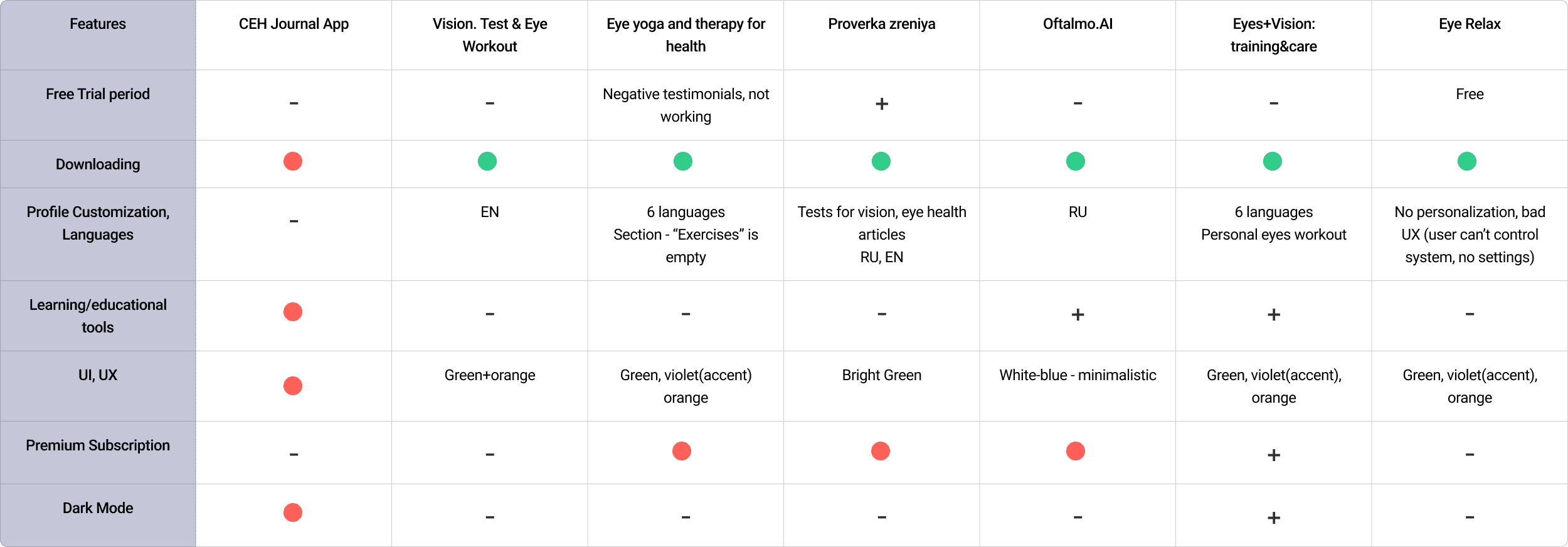
Insight 2: Users resist paying for the unknown
Competitive analysis of 15 vision-training apps showed a recurring pattern: most products push users to pay upfront, offering little or no meaningful trial experience.
This creates friction early in the journey. Users feel pressured before they understand the value, which undermines trust and increases hesitation.
The insight reframed monetization as a trust problem, not a pricing one — users are willing to pay, but only after experiencing tangible value and feeling in control of the decision.
Examples of Competitor App Interfaces
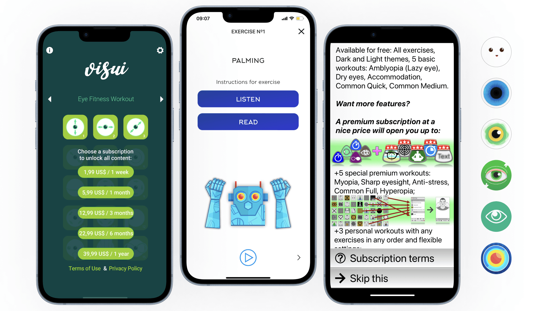
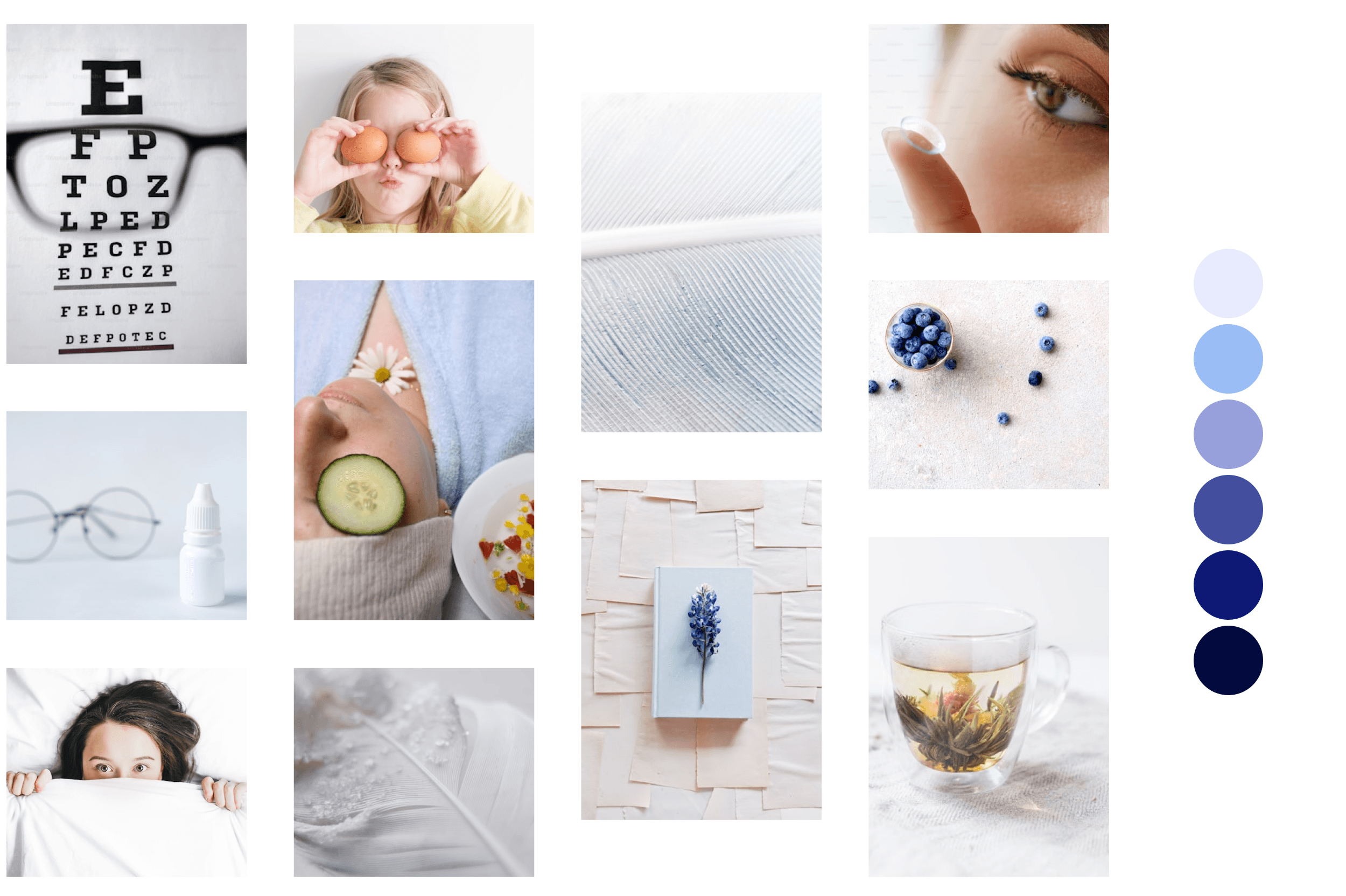
Insight 3: Visual sameness makes it difficult to stand out and to feel safe
During visual benchmarking, I noticed that most competitors rely on similar green and orange color schemes, often associated with “health” but also visual intensity and alertness.
For users already experiencing eye strain, this visual language can feel overstimulating rather than supportive.
To differentiate SeeBetter and reinforce a sense of calm and trust, I chose a cooler blue palette. This decision was not only about brand distinction, but about reducing cognitive and visual load, supporting accessibility, and signaling relief from the very first interaction.
User Flow
To address onboarding friction uncovered during the research phase, I designed the user flow around one core principle: reduce cognitive load before asking for commitment.
The journey starts with a simple sign-up or login, followed by a short vision test that allows users to quickly understand how the app adapts to their individual needs. Instead of exposing all features upfront, the flow focuses on delivering immediate, personalized value through tailored exercise recommendations based on the test results.
This early personalization helps users feel guided rather than overwhelmed and creates a clear sense of direction from the very first interaction. By limiting choices during onboarding and progressively introducing functionality, the flow minimizes decision fatigue and keeps the experience approachable for visually tired users.
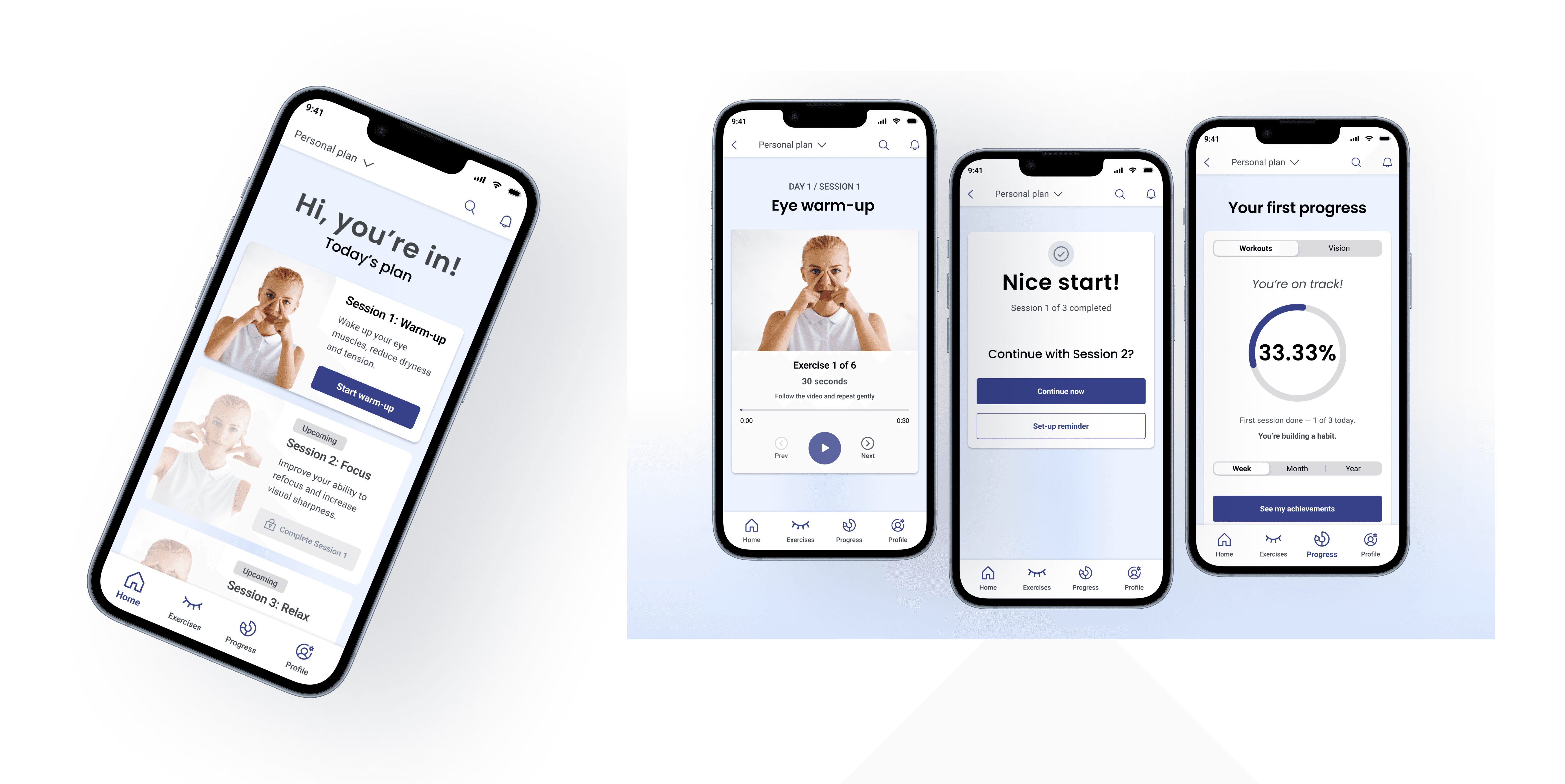
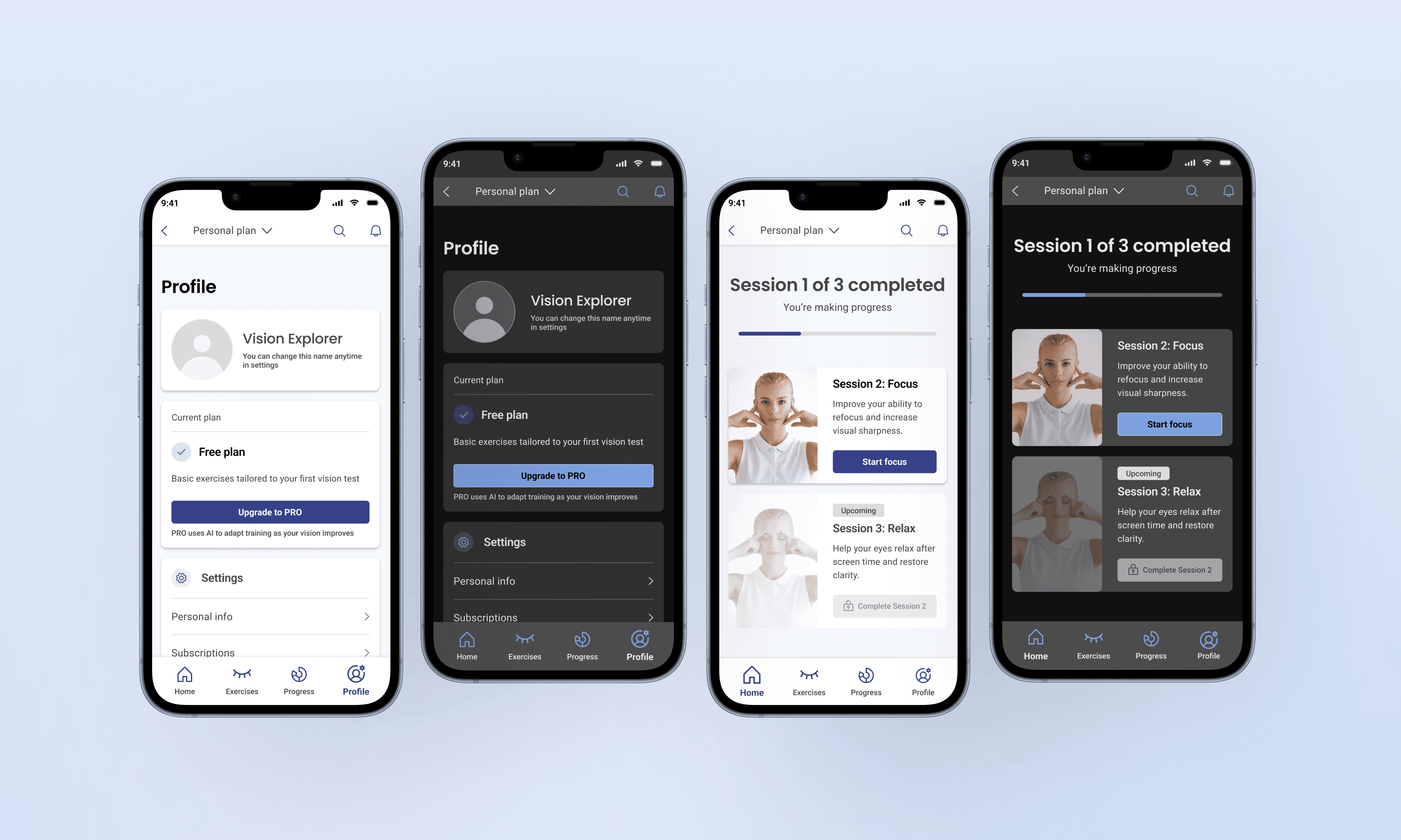
Once users receive their recommendations, they are taken to the Home screen, which serves as a central hub for daily exercises, progress tracking, and quick access to key actions. Recommended exercises are prioritized, while manual search remains available as a secondary option for more advanced or motivated users.
Progress feedback is intentionally introduced early through visual indicators and progress diagrams. This reinforces a sense of achievement and helps users understand the impact of consistent practice without relying on long-term commitment or external motivation.

Overall, the user flow is designed to support habit formation by combining early value delivery, clear structure, and gradual complexity. Progress feedback is intentionally introduced early through visual indicators and progress diagrams, reinforcing a sense of achievement without relying on long-term commitment or external motivation.The goal of this flow is not only to guide users through the app, but to build trust by making progress visible, achievable, and meaningful from the very first session.
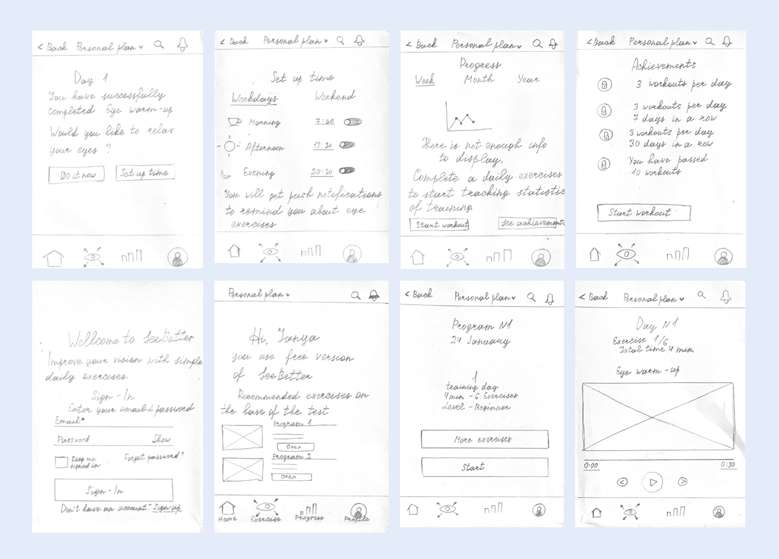
Early Sketches
Early in the project, I explored multiple concepts for reminder flows, session setup, and progress feedback using hand-drawn sketches. The goal was not visual polish, but rapid exploration of different interaction patterns and behavioral triggers that could support daily eye-training habits.
These sketches helped me quickly compare different approaches: scheduled vs. contextual reminders, passive prompts vs. explicit calls to action, and alternative ways of introducing progress and achievements without creating pressure.
I focused especially on reducing friction around daily sessions — experimenting with how much information should be shown before starting an exercise, when to ask users to commit to a time, and how to frame reminders so they feel supportive rather than intrusive.
Through this low-fidelity exploration, I identified patterns that felt too demanding or visually heavy and narrowed the direction toward a calmer, more guided experience. These sketches became the foundation for defining the final user flow and informed key decisions around personalization, motivation, and habit-building in later stages of the design.
Result.
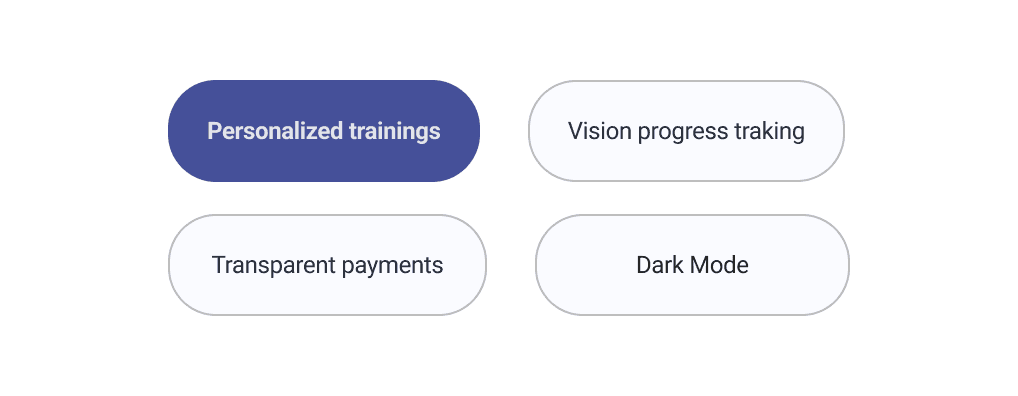
Solutions
Each solution was designed to remove the biggest barriers uncovered in research and competitor analysis: visual fatigue, decision overload, and low trust during onboarding and pricing.
Instead of adding more “features,” I focused on calm guidance, transparent value, and personalization that feels supportive from the first interaction.
Core principles behind the UX:
Reduce cognitive load for visually tired users
Make value obvious early (before asking for commitment)
Keep the experience predictable, gentle, and trust-building
Key UX Solutions
Streamlined UI (calm-by-default)
Each screen is designed around a single primary action, reducing decision fatigue and helping users move through sessions without cognitive overload.
Users who experience eye strain are more sensitive to visual noise and dense layouts. I designed the interface to feel light, structured, and “quiet” at every step.
What I implemented:
Clear typographic hierarchy and generous spacing
One primary action per screen to reduce decision fatigue
Simple navigation patterns and minimal UI chrome
Why it matters: users can stay focused during short sessions without feeling overstimulated.
AI-powered personalization (without pressure)
Most vision apps ask users to commit early. I reversed the pattern: first, I help users feel understood and guided — then I personalize the plan.
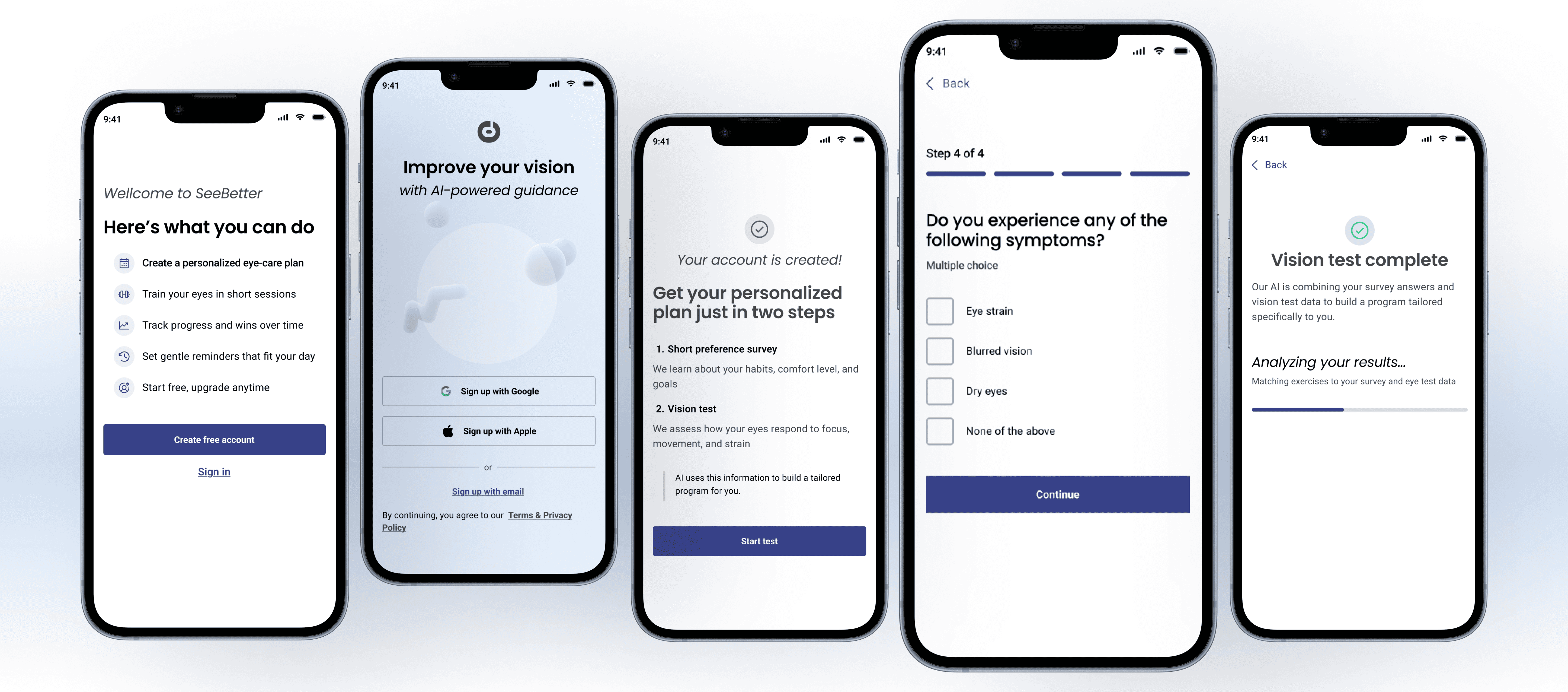
What I implemented:
A short onboarding flow that collects preferences in plain language
A lightweight vision check to anchor recommendations
A personalized plan that adapts based on progress and consistency
Why it matters: personalization increases relevance, while the gentle flow keeps motivation high.
Vision progress tracking (motivation through clarity)
To support long-term engagement, users need to see progress but in a way that doesn’t feel stressful or clinical.
What I implemented:
Clear progress states (session completion, streaks, and milestones)
Simple charts that emphasize trend, not perfection
“Small wins” framing to reinforce habit building
Why it matters: progress becomes encouraging feedback, not pressure.
Transparent pricing (trust before payment)
Competitor analysis revealed that most vision-care apps introduce payment before users experience real value. Early paywalls and vague subscription terms create friction, increase drop-off, and undermine trust.
What I implemented:
A visible free trial and a clear subscription model
Pricing communication that explains what’s included (no hidden locks)
“Value first” messaging before any payment decision
Why it matters: users feel in control, which reduces drop-off at the most sensitive moment.
Dark Mode (comfort for tired eyes)
Many users train after work exactly when eyes are most fatigued. Dark Mode supports comfort without changing the core hierarchy.
What I implemented:
Dark Mode with preserved contrast and readable hierarchy
Reduced glare and softer background surfaces
Consistent components across modes to keep predictability
Why it matters: the app remains usable when users need it most.
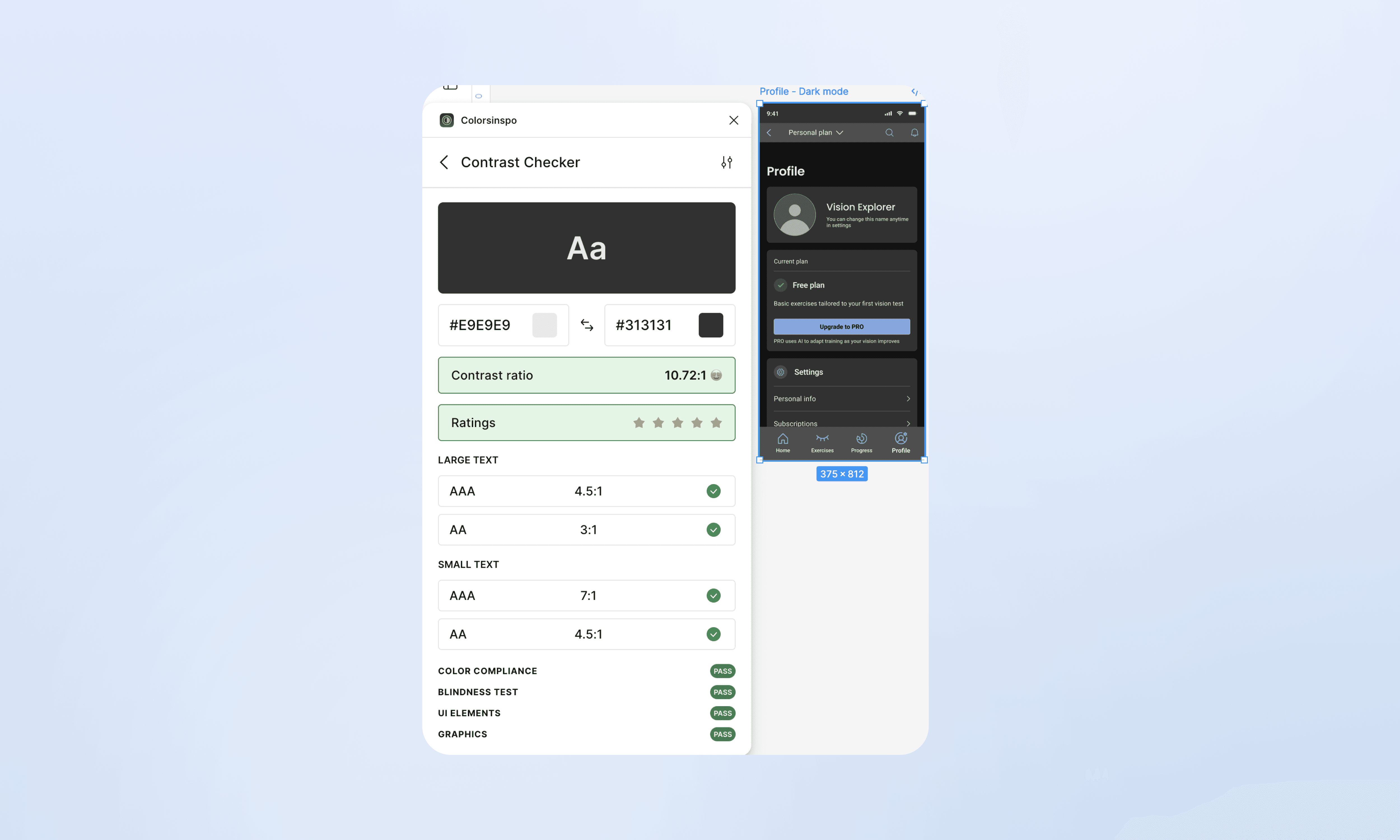
Accessibility & WCAG Alignment
All interface colors and UI elements were intentionally designed and validated in alignment with WCAG accessibility guidelines.
Special attention was given to contrast ratios, text readability, and visual hierarchy, ensuring the interface remains comfortable and clear across different lighting conditions and visual sensitivities.
The Dark Mode was carefully designed and tested to reduce eye strain, with balanced contrast levels and softened background surfaces, not a simple color inversion, but a deliberately crafted alternative optimized for prolonged use.
Both light and dark themes were checked using accessibility tools to ensure:
sufficient contrast for primary and secondary text,
clear differentiation of interactive elements,
consistent readability across key user flows.
Accessibility was treated as a core design quality, not an afterthought, supporting users with screen sensitivity, early vision fatigue, or extended daily usage.
Contrast validation for Dark Mode
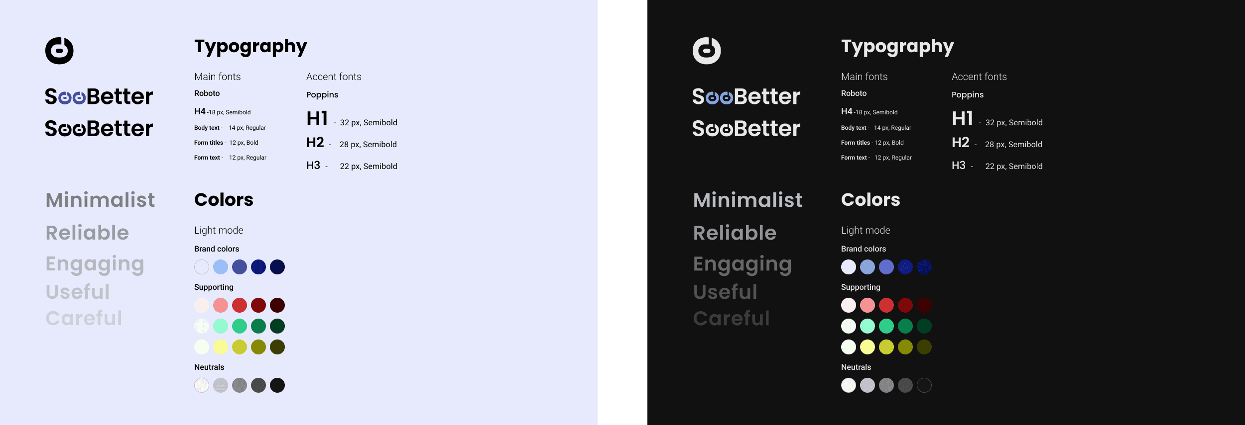
Brand Identity
To stand out in a crowded market of bright and overstimulating wellness apps, SeeBetter uses a calm, restrained visual language focused on clarity and trust.
The brand is built around soft blue tones, neutral backgrounds, and minimal contrast accents to reduce visual fatigue and support daily eye-care routines.
Typography and spacing are intentionally simple, helping users stay focused on exercises without unnecessary distraction.
The overall identity reinforces SeeBetter as a reliable, caring, and user-centered solution for long-term vision support.

Prototyping & Usability Testing
To validate the core user flow and assess how confident users felt while interacting with the product, I conducted lightweight usability testing using an interactive prototype.
The focus was not only on task completion, but also on perceived clarity, trust, and emotional comfort, especially important for a health-related product.
Key observations
Users navigated the interface with minimal friction
Session structure and progress states were clear and predictable
The absence of early monetization pressure positively affected trust
In contrast to many similar applications, where paid features are pushed before users can experience the core value, this flow introduced monetization gradually, positioning it as a natural continuation rather than an obligation.
User feedback & metrics
Users were asked to rate their level of confidence and trust while using the interface on a 5-point scale.
Average confidence score: 4.4 / 5
Users described the experience as
transparent and easy to understand
calm and non-intrusive
respectful of their pace and choice
Design impact
Insights from testing directly influenced design decisions
Progress indicators were emphasized over textual explanations
Session states (active, completed, upcoming) were made more explicit
Paid features were framed around demonstrated value, not urgency
Outcome
The resulting experience feels clear, trustworthy, and supportive, helping users build confidence before being introduced to premium functionality, aligning user needs with business goals without sacrificing trust.
Social Impact
SeeBetter is more than a training app: it promotes healthier digital habits and a more conscious approach to long-term vision care.
By prioritizing trust, personalization, and accessibility, the product helps users take control of their visual well-being in a screen-intensive environment, without pressure or fear-based messaging.
The inclusive design supports a wide range of users: from students to remote professionals, while encouraging proactive eye care through small, sustainable daily actions rather than reactive treatment.
What's Next
With further development, the product could evolve in several strategic directions focused on long-term engagement, trust, and adaptability.
Gamification & Personal Motivation
Introduce a customizable virtual guide to support daily motivation, reinforce healthy habits, and strengthen emotional connection without increasing cognitive load.
AI-Powered Adaptation
Extend adaptive training logic to better respond to individual vision sensitivity, usage patterns, and fatigue levels through intelligent pacing and personalization.
Medical Collaboration
Explore collaboration with certified eye care professionals to validate training logic and provide expert-backed guidance where appropriate.
Expanded Accessibility
Accessibility in SeeBetter focuses on reducing unnecessary eye strain rather than replacing visual interaction.
Scalable typography and high-contrast modes support comfortable reading during setup and progress review
Optional text-to-speech assists users during onboarding and recovery phases, allowing instructions to be consumed without visual overload
Accessibility decisions were guided by the product’s core goal: supporting visual training without introducing conflicting interaction patterns
Smart Feedback Loops
Provide meaningful progress insights and gentle behavioral suggestions based on usage trends , while maintaining transparency and respecting user privacy.
My Takeaways
One of the key insights from this project was how strongly user trust depends on the very first interaction.
During usability testing, users showed hesitation to engage deeply until they clearly understood what they were getting and whether the product felt safe and transparent. Any sense of pressure or premature monetization significantly reduced confidence and willingness to continue.
This reinforced an important design principle for me: a free, transparent entry point is not a “nice-to-have”, but a critical requirement for products that aim to support health, habit formation, or long-term behavior change.
Designing a calm, honest onboarding flow allowed SeeBetter to gently guide users toward business goals without sacrificing trust, turning clarity and respect into a foundation for engagement.
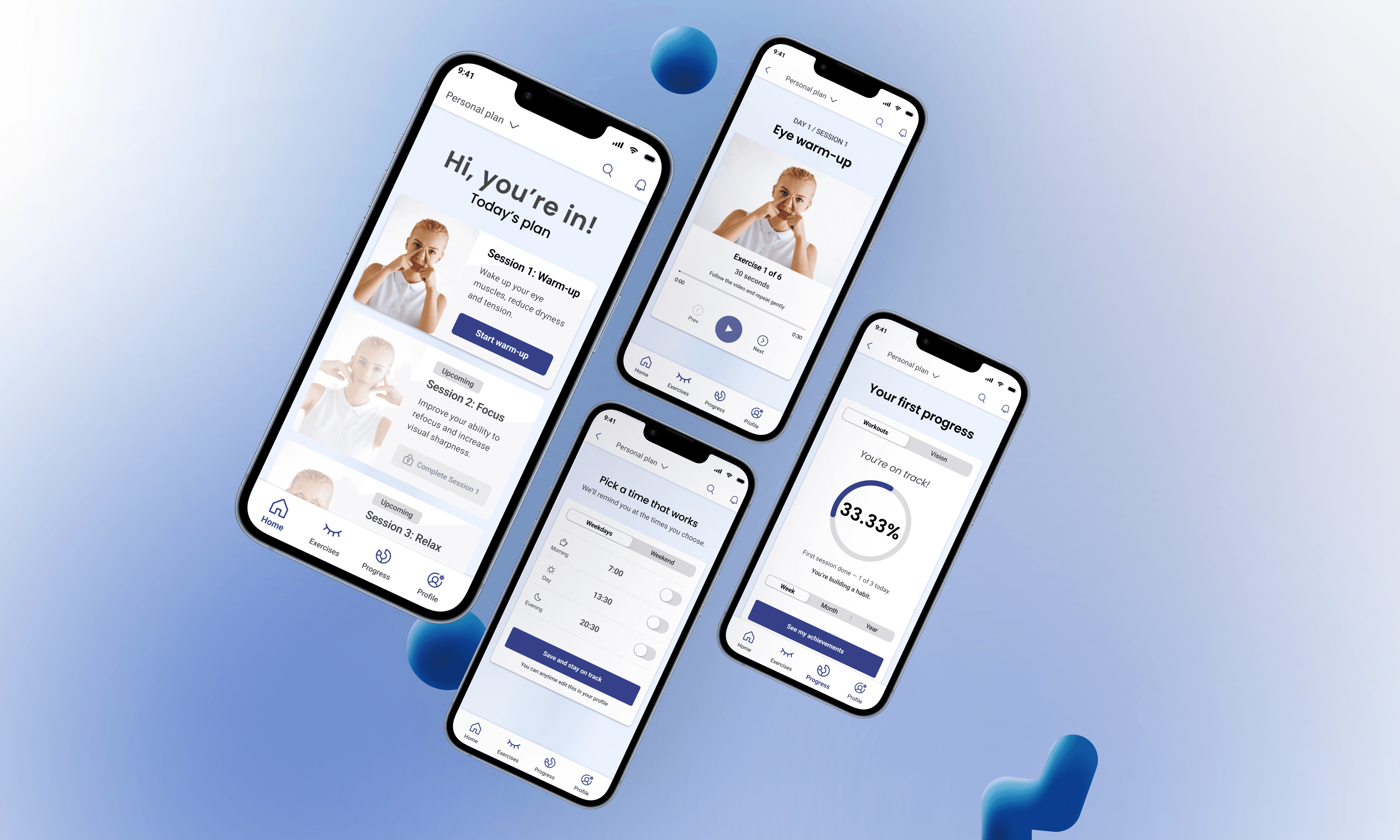
See the Experience in Action
This walkthrough demonstrates the core user flow — from the first app entry to completing an initial training session and reviewing early progress.
The focus is on clarity, personalization, and building trust through gradual engagement.
User flow highlights:
Entering the app and landing directly on the onboarding experience
Onboarding explains the value proposition and sets expectations
Completing a short questionnaire aligned with the user’s goals, schedule, and daily availability
Passing an initial vision assessment to understand individual visual needs
Receiving a personalized training plan generated based on inputs and test results
Starting one of the recommended training sessions
Choosing whether to continue with the next session or pause and set a reminder
Setting a training reminder for a later time
Reviewing progress after the completed session
Exploring achievements unlocked through the first training
Accessing profile settings and switching to Dark Mode
Returning to Home to view the remaining recommended sessions for the day
The flow is designed to gently guide users toward long-term engagement without pressure — allowing them to move at their own pace while still experiencing early progress.

